Mobile-Optimized Emails: 5 Key Tips to Optimize Your Emails
So, what are mobile-optimized emails, and how can you make your emails more readable on mobile devices? In this post, we'll discuss why this marketing channel is so significant.
We also provide five mobile email optimization recommended practices to help you boost your marketing efforts.

Mobile-optimized email for better User Experience
Majority of Email Opens on Mobile
Variation by Industry

Impact of Email Design
Better Email Performance Metrics
From a business perspective, optimizing emails for mobile devices can significantly improve key performance metrics such as open rates, click-through rates, and ultimately, conversions. If an email displays poorly on a mobile device, recipients are more likely to delete it or unsubscribe, adversely affecting these metrics.
Key Elements of Mobile-Optimized Emails

1- Responsive Design
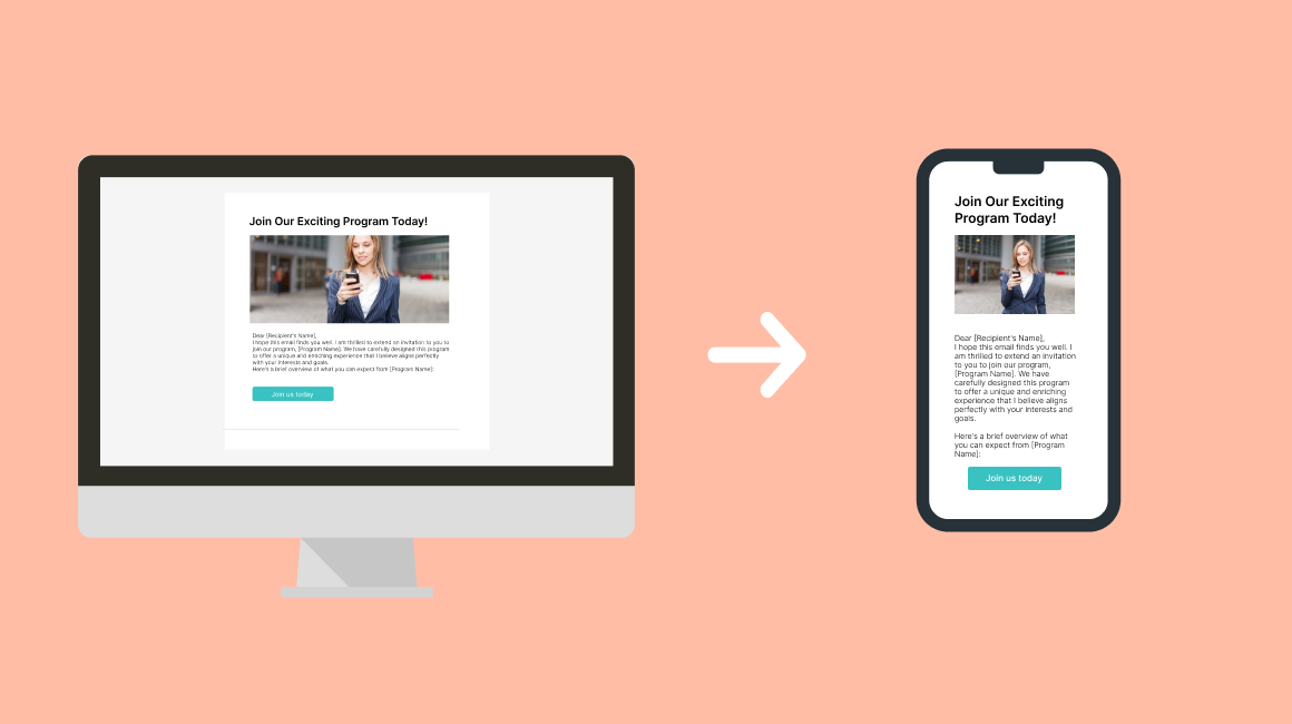
Responsive design is a technique where the email layout adjusts according to the screen size it is viewed on. This flexibility ensures that whether an email is opened on a desktop, tablet, or smartphone, it maintains readability and usability.
A lot of email marketing platforms can adapt to mobile devices, which allows for a more mobile-friendly design. By navigating to the template's design, you can find the mobile section where you can customize the margins, padding, sizes, and more to fit any mobile device.
After that, you can send the template to your own email address on your device and make sure that everything is responsive.
Emails are designed using fluid grid layouts that automatically adjust the width and positioning of elements based on the screen size. This prevents content from appearing too crowded or too sparse on different devices.
When designing email templates using HTML, incorporating media queries in CSS is the key to creating mobile-friendly emails. Media queries allow you to define specific styling rules that adapt to different screen sizes and devices. By using media queries effectively, you can ensure that your email templates automatically adjust their layout, font sizes, and image dimensions to provide an optimal viewing experience on mobile devices.
This approach not only enhances the readability and usability of your emails but also contributes to a seamless and engaging interaction for recipients, regardless of the device they use to access their emails.
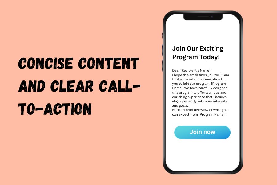
2. Concise Content and Clear Call-to-Action
Mobile users often skim content. Therefore, emails should be concise and to the point. A clear and compelling call-to-action (CTA) is crucial, as it guides users towards the desired action, whether it's visiting a website, making a purchase, or signing up for a service.

Suitable Font Size and Button Design
The font size should be large enough to be easily readable on small screens. Similarly, buttons and links should be designed with the touchscreen user in mind, meaning they should be large enough to tap without zooming in.
Optimized Images and Load Times
Images should be optimized for quick loading on mobile devices. Large image files can slow down load times, leading to a poor user experience and potentially causing users to abandon the email before it fully loads.
Testing Across Devices
Finally, it is essential to test emails across different devices and email clients to ensure consistency in user experience. What looks good on one device may not translate well to another, making testing a critical step in the optimization process.

